PsyFrog
January 15, 2022

Overview
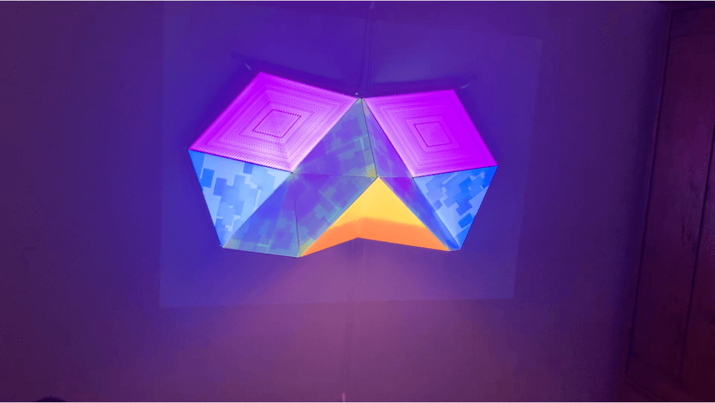
The project began as an experiment with 3D shapes and building a narrative by progressively filling the figures. The design is based on an abstract assembly of triangles provided by the Olga kit and inspired by Wintercroft Masks. The visuals and scene management were designed to mimic the aesthetics of a psytrance music festival.
Source Code: Github Repo
Demo Video: PsyFrog
Concept and Background Research
The concept for this project started as a simple goal to create an abstract shape design that mimicked facial features. The idea was to slowly reveal the facial features by showing different combinations of shapes and letting the audience recognize the pattern.
The final shape design was created after I received and assembled by Olga kit (HeavyM, 2021). Initially, the design started as an attempt to create a heart-shaped head, but based on how it appeared when mounted on the wall, I decided to shift to an owl-like face.
When mounting the display, I realized I did not like how some of the facial features were drooping, so I adjusted the figure to press more against the wall. This modification changed the facial structure from owl-like to more frog-like. Also, the display was mounted with a simple pulley system, which helped adjust the display’s height based on the arrangement of my projector. The cords are not intentional in the concept design but were necessary for keeping the figure in position.
My personal experiences with music festivals and concerts formed the basis of my stylistic choices. I did not focus on reviewing light shows but chose to design an experience based on visual flow. For example, I wanted the visuals to focus attention on the current facial feature and the upcoming visual. So I designed the visualizations to move as pieces of a facial structure and gesture to the next section. I also and added bright colors to give this sense of psychedelic immersion.
Technical Implementation
Some of the technical aspects of the project were based on the display placement and physical light from the projector. For example, the “nose” of the display has a sharp angle because of the placement of the projector, so I chose to implement a visualisation that wouldn’t reflect too much light onto the neighbouring faces. The intensity of the light was also likely due to how close the project was to display because of the size of the room.
The implementation for each visual was created based on some of my prior work with sine waves, random colours, and drawing outlines. Though in this work, I spent more time tinkering with constant motion.
Initially, I created a rough version of the ofPiMapper layout and started implementing the visualizations. Later on, I adjusted the main layout to be as accurate as possible with each visualization running. Finally, I cloned the main scene and configured the scene manager to reveal each section over time. The “mouth” is a scaling rectangle that appears to open and close. The “nose” uses a zig-zag drawing technique to fill the sections with changing colours over time. The “eyes” section repeatedly draws square outlines with shifting colours and different sizes. And the final piece adapts the “BouncyBalls” source to create a floating “bubbles” source, which is mainly used for a light show in the finale.
Reflection and Future Development
Overall I think the project went well, the construction of the shape was easy and straightforward, and I feel the visualizations make good use of the 3D faces. But I felt the floating bubbles reveal themselves too quickly, and though I tried to work around this by using them as flickering lights, they would be better if revealed slowly. In the future, I would like to design the scenes around the pace of a popular song. The flashing lights and rhythmic animations would be more enjoyable with a simple psytrance song in the background.